Уникальный вид материал для uCoz
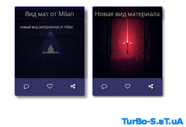

Здравствуйте) вот еще одна вид материал для вас) данный вид подойдет для музыкального сайта, также для создание кино портала или соц сети.
Во многом тематике можно использовать данный вид лишь изменив его чуть чуть всё.
Установка:
Нужный модуль - в вид материал ставим:
Теперь ставим чуть внизу CSS стили в теге style
Вот и всё!
P.s - данный вид был тестирован на тестовом сайте! вид 100% рабочий! и да скриншот не очень красиво получилось.
Во многом тематике можно использовать данный вид лишь изменив его чуть чуть всё.
Установка:
Нужный модуль - в вид материал ставим:
Код
<div class="card-container">
<div class="card">
<div class="card-image"> <img style="width:100%; height:280px" src="$IMG_URL1$"/> </div>
<div class="card-info">
<div class="card-title">$TITLE$</div>
<div class="card-detail">$MESSAGE$</div>
</div>
<div class="card-social">
<ul>
<li><i class="fa fa-comment-o" aria-hidden="true"></i>
</li>
<li><i class="fa fa-heart-o" aria-hidden="true"></i></li>
<li><i class="fa fa-share-alt" aria-hidden="true"></i>
</li>
</ul>
</div>
</div>
</div>
Теперь ставим чуть внизу CSS стили в теге style
Код
<style>
.card-container {
position: relative;
flex-wrap: wrap;
float:left;
overflow: hidden;
padding-top: 15px;
padding-bottom: 15px;
display: flex;
justify-content: space-around;
align-items: auto;
}
.card {
min-width: 275px;
width: 275px;
position: relative;
margin: 15px 15px;
height: 350px;
border-radius: 7px;
background-size: cover;
background: rgba(0, 0, 0, 0.2);
box-shadow: 5px 5px 10px 1px rgba(0, 0, 0, 0.3);
transition: 0.2s all linear;
border: 1px solid rgba(128, 128, 128, 0.15);
box-sizing: border-box;
background: rgba(0, 0, 255, 0.5);
}
.card .card-social {
position: absolute;
height: 75px;
width: 100%;
background: red;
border-bottom-right-radius: 5px;
border-bottom-left-radius: 5px;
background: rgba(0, 0, 0, 0.6);
box-shadow: 2px 2px 10px 0px rgba(0, 0, 0, 0.5);
top: 275px;
}
.card .card-social ul {
padding: 0;
margin: 0;
list-style: none;
width: 100%;
height: 100%;
display: flex;
justify-content: space-around;
}
.card .card-social ul li {
height: 100%;
text-align: center;
line-height: 75px;
font-size: 1.5em;
color: rgba(255, 255, 255, 0.85);
text-shadow: 5px 5px 5px rgba(0, 0, 0, 0.5);
}
.card .card-social ul li:hover {
text-shadow: 7px 7px 5px rgba(0, 0, 0, 0.7);
transition: all 0.1s linear;
}
.card .card-image {
width: 100%;
height: 275px;
position: relative;
border-top-right-radius: 5px;
border-top-left-radius: 5px;
}
.card .card-info {
position: relative;
width: 100%;
height: 35px;
line-height: 35px;
top: -265px;
border-top-right-radius: 5px;
border-top-left-radius: 5px;
font-family: "Open Sans";
color: rgba(255, 255, 255, 0.85);
}
.card .card-info .card-title {
line-height: 35px;
height: 35px;
position: relative;
top: 0px;
font-size: 25px;
text-align: center;
background: rgba(0, 0, 0, 0.6);
box-shadow: 5px 5px 10px 2px rgba(0, 0, 0, 0.3);
}
.card .card-info .card-detail {
line-height: 1.5em;
font-size: 1em;
height: 220px;
background: rgba(0, 0, 0, 0.6);
position: relative;
top: 5px;
padding: 5px 20px 0px 20px;
opacity: 0;
transform: scaleY(0);
transform-origin: center top;
box-shadow: 5px 5px 10px 2px rgba(0, 0, 0, 0.3);
}
.card:hover {
box-shadow: 10px 10px 10px 1px rgba(0, 0, 0, 0.3);
}
.card:hover .card-info .card-title {
box-shadow: 10px 10px 10px 1px rgba(0, 0, 0, 0.3);
transition: 0.3s all linear;
}
.card:hover .card-info .card-detail {
opacity: 1;
box-shadow: 10px 10px 10px 1px rgba(0, 0, 0, 0.3);
transition: 0.35s all linear;
transition-delay: 0.1s;
transform: scaleY(1);
}
</style>
Вот и всё!
P.s - данный вид был тестирован на тестовом сайте! вид 100% рабочий! и да скриншот не очень красиво получилось.
Скачать бесплатно - [.]
без регистрации через 5 сек.
Или скачать без ожидания.
Или скачать без ожидания.
